Monday, 25 January 2016

Info Graphic, How to get your inheritance faster in 7 easy steps style research.

Tim Burton

The Melancholy Death of Oyster Boy & Other Stories is a 1997 poetry book written and illustrated by film director Tim Burton. The poems, which are full of black humour, tell stories of hybrid kids, spontaneous transformers, and women who have babies to win over men.

This style of drawing is what I am looking for in my animation, simple shapes with detail imprint on to them. This style will fix in with my drawing skills.  


Edward Gorey
 
The Gashlycrumb Tinies: or, After the Outing is an abecedarian book written by Edward Gorey that was first published in 1963. Gorey tells the tale of 26 children (each representing a letter of the alphabet) and their untimely deaths in rhyming dactylic couplets, accompanied by the author's distinctive black and white illustrations. It is one of Edward Gorey's best-known books.
 
This style Edward Gorey uses in The Gashlycrumb Tinies would fix in well with my info graphic as it crates a dark out look through the drawing and the stories.  


After talking to Phil he said I should look at simpler way to draw but with details so I don't get hang up on the drawing side of the project. He mentioned to look into Tim Burton, Edward Gorey, David Shrigley and Purple Ronnie. Out of these 4 I chose to look into Tim Burton and Edward Gorey as they were the most fixing. We also talked about having a style that looked like it was in the back of a sketchbook, almost like a childes drawing out plans to kill his family members which would fix in the style of Burton and Gorey.  

Friday, 22 January 2016

Info Graphic, How to get your inheritance faster in 7 easy steps research.

How to get your inheritance faster in 7 easy steps is the name for my info graphic. While talking to Alan about my info graphic he suggested to look into what inheritance means as that is the main word. In the dictionary Inheritance means something that is or may be inherited; property passing at the owner's death to the heir or those entitled to succeed; legacy.
 
My info graphic will be about taking out your family members to get your inheritance money faster. I looked into family tree websites and how they are laid out to see if I could replicate their style or layout. Most of the websites have a sort of universal layout with a few slight varitations.     


I am thinking that my info graphic style will be in the layout of a tree and each member of the family is on a branch. The head of the family i.e. the grandfather is at the top and you are at the bottom of the tree. With each member it zooms in on the branch and then show a way to get rid of them. Each way will be a comical or stereotypical way that would fit in with how that family member lived making seem like an accident. 


Film review: Mary and Max

Mary and Max
 
Mary and Max (2009) Poster
 
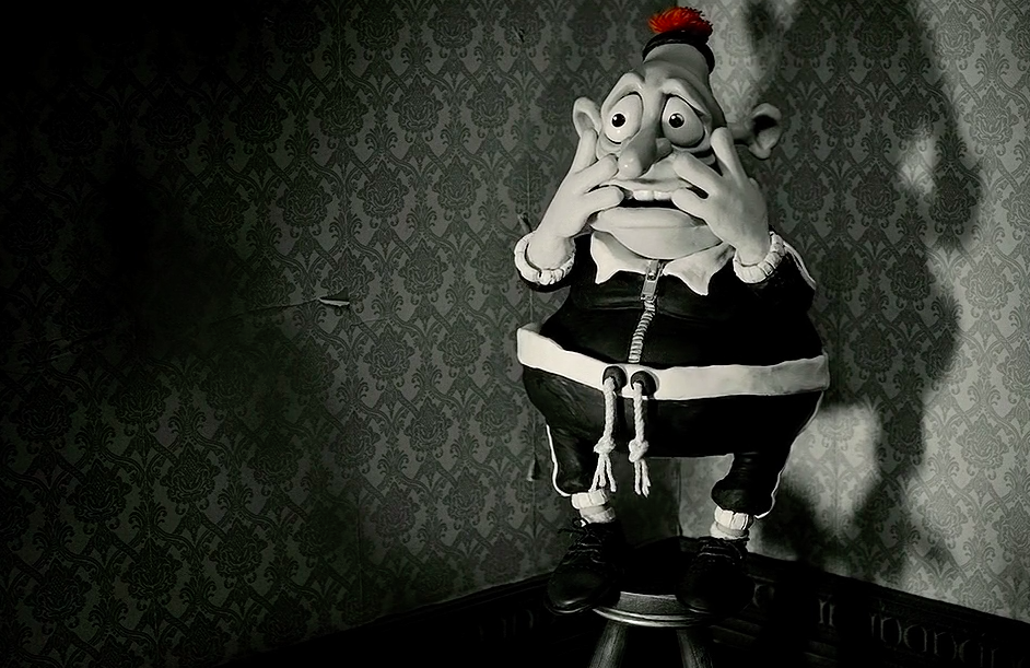
Fig 1. DVD cover
 
Mary and max is a stop motion animated dark comedy-drama film made in 2009, Mary and Max won 4 awards in total . Written and directed by Adam Elliot, it received generally very positive reviews from critics and it earned $1.7 million on a $8.2 million budget.
 
 
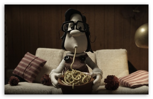
Fig 2. Mary and Max
 
Mary and Max is about an eight-year-old friendless Australian girl and a forty-four-year old, severely obese man living in New York. Mary is being bullied at school and her mum and dad are not really involved with her. Mary wants someone to talk to so she rips out an address from the address book. Mary then sends a letter to the address she took from the book, in the letter Mary asks Max questions about life. When Max gets the letter and reads it he has a break down. When Max has pulled him self together he replies, which then starts a 20-year correspondence friendship.
 
 
Fig 3. Max having a break down
 
Max later in the animation finds out he has Asperger's and is put in a asylum as back in the 1976 they did not really understand much about  Asperger syndrome. After being released from the asylum Max's therapist tells him to stay away from things that might set him off. It getting to a point where Max replies to Mary to let her know why he did not reply to her letters. Once Mary finds out about Max's Asperger syndrome she goes on to study psychology at university using Max as her case study but does not let him know until she writes a book on him. When Mary finally tells Max he is not happy at all and rips the "M" key out of his typewriter, he replies saying that he does not see it as a disability that needs curing and that he does not want to talk anymore. Mary pulls all the books and destroys them, she sends a "I am sorry" gift to max but he does not reply back which sends Mary into depression and then she starts drinking cooking sherry like her mum.
 
Max finally realises that Mary is not perfect like him, and he sends her a gift to show he forgives her. Mary starts to save up again to visit Max but by the time she gets there Max is dead on the sofa. Mary sits down next to him and looks up and see all the letters she's has sent him over the years, laminated and stuck to the ceiling. Mary smiles and realises how much her friendship really meant to Max, finishing on a glass half full or a glass half empty outlook. 
 
Mary And Max Spaghetti HD wallpaper for Standard 4:3 5:4 Fullscreen UXGA XGA SVGA QSXGA SXGA ; Wide 16:10 5:3 Widescreen WHXGA WQXGA WUXGA WXGA WGA ; HD 16:9 High Definition WQHD QWXGA 1080p 900p 720p QHD nHD ; Other 3:2 DVGA HVGA HQVGA devices ( Apple PowerBook G4 iPhone 4 3G 3GS iPod Touch ) ; Mobile VGA WVGA iPhone iPad PSP Phone - VGA QVGA Smartphone ( PocketPC GPS iPod Zune BlackBerry HTC Samsung LG Nokia Eten Asus ) WVGA WQVGA Smartphone ( HTC Samsung Sony Ericsson LG Vertu MIO ) HVGA Smartphone ( Apple iPhone iPod BlackBerry HTC Samsung Nokia ) Sony PSP Zune HD Zen ; Tablet 2 Android ;
 
Fig 4. Mary older
 
The design of the sets was well done and fixed into the 1976 décor and era for both New York City and Australia. The colour hues for Australia were warmish colours that you would imagine to see in Australia with oranges and reds, where as the colours hues in New York City were dark and dull representing either Max's life or how the city was at the time. These two different colours help you feel that the two different environments are different and these environments finally come together at the end when Mary visits Max and you see both the warm colours and dull colours come together.   


Illustration List:
 
Fig 1. DVD cover
 
 
Fig 2. Mary and Max
 
 
Fig 3. Max having a break down


Fig 4. Mary older


Monday, 18 January 2016

Pipeline 2: Games assets. Modelling Part 1: Low Resolution, Modelling Part 2: UV Layout and Modelling Part 3: High Resolution

Modelling Part 1: Low Resolution
 
Low resolution model of a bridge


Modelling Part 2: UV Layout

UV layouts and Low resolution model done


Modelling Part 3: High Resolution

High resolution model ready for baking


Friday, 8 January 2016

Video Info Graphic - Ideas for names.

So the title I got for my video info graphic was How to ______ in (number) easy steps. I started of by brain storming ideas and wrote down categories like Serious, Funny, Funny Horror, Very dark. I used the categories to help me get a feel of what the info graphic could actually be about and I came up with 21.

How to eat food in 4 easy steps
How to bake a cake in 7 easy steps
How to put petrol in a car in 5 easy steps
How to open a can in 6 easy steps
How to get dressed in the morning in 8 easy steps
How to get grounded in 8 easy steps
How to summon Satan in 6 easy steps
How to be a hipster in 8 easy steps
How to tell if there is a monster under your bed in 5 easy steps
How to tell if you cat is trying to kill you in 5 easy steps
How to live with a cat in 6 easy steps
How to bath dog in 5 easy steps
How to be a student in 10 easy steps
How to tell if your girlfriend is a werewolf in 5 easy steps
How to not survive in a zombie apocalypse in 5 easy steps
How to stop a Zombie in 8 easy steps
How to ruin a kid's childhood in 4 easy steps
How to tell if you have been abducted by aliens in 10 easy steps
How to take over the world in 8 easy steps
How to get your inheritance faster in 7 easy steps
How to get thrown in jail in 8 easy steps

The 10 that suck out more for me was

How to tell if you cat is trying to kill you in 5 easy steps
How to not survive in a zombie apocalypse in 5 easy steps
How to tell if you have been abducted by aliens in 10 easy steps
How to ruin a kid's childhood in 4 easy steps
How to get your inheritance faster in 7 easy steps
How to bath dog in 5 easy steps
How to get grounded in 8 easy steps
How to summon Satan in 6 easy steps
How to be a hipster in 8 easy steps
How to be a student in 10 easy steps


Maya Tutorials: Pipeline 1 Body Modelling Part 14 Torso, Part 15 The Lower Body Part 1, Part 16 The Lower Body Part 2, Part 17 The Arm, Part 18 The Hand, Part 19 The Shoes, Part 20 completion: Bring The Head & Body Together (Head Updated)

Final finished the model


Update
 
Head resized to fix better


Maya Tutorials: Pipeline 1 - Head Modelling Part 11 Hair Pair 2, Head Modelling Part 12 The Eyebrows, Head Modelling Part 13 The Eyeballs

Thought it would be easier then doing three separate Maya posts.
  

Friday, 1 January 2016

Character Design, Props

These were my sword ideas for my evil character and the final sword for him.


My final sword is a mix of all three of the swords. The pommel and grip are from idea three, the cross-guard and blade shape is from idea 2 and the styling near the hilt is a slightly changed version of idea one. I feel like the final version fits best with my evil character.